Introduction
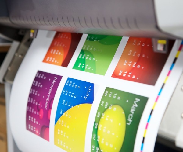
In the printing industry, color variation is a constant challenge. Even when the same ink and printing machine are used, a change in paper can lead to noticeable color differences. As one of the most essential materials in printing, paper type and quality play a decisive role in how colors appear. In this article, Golden Paper explains, from a manufacturer’s perspective, how key paper properties influence printing color differences.
Why Paper Properties Can Affect Printing Color Difference?
Paper Brightness
Paper brightness is one of the most direct factors that affect printed color appearance. Even with the same ink, papers with different brightness levels can produce very different visual results.
In printing, it’s often said that “the base color determines the top color.” The brightness of paper (usually measured by ISO brightness) acts as the base tone of a canvas. High-brightness paper reflects more light, making colors appear vivid and saturated. On the other hand, papers with lower brightness—such as recycled paper or duplex board—tend to absorb more light, resulting in darker or duller printed colors.
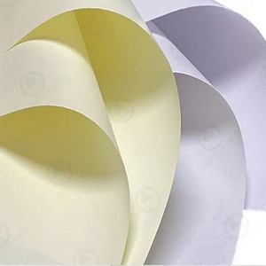
For example, printing blue on slightly yellowish paper may cause it to appear greenish, while red may shift toward orange. This “background color overlay” effect is a common reason printed materials look “off.”
Another factor to watch out for is optical brightening agents (OBA). While they make paper appear whiter to the eye, they can cause colors to shift under different lighting conditions (daylight vs. fluorescent light). To minimize color variation, choose printing paper from a reliable supplier that maintains consistent brightness and avoids excessive use of OBAs.
Paper Smoothness and Gloss
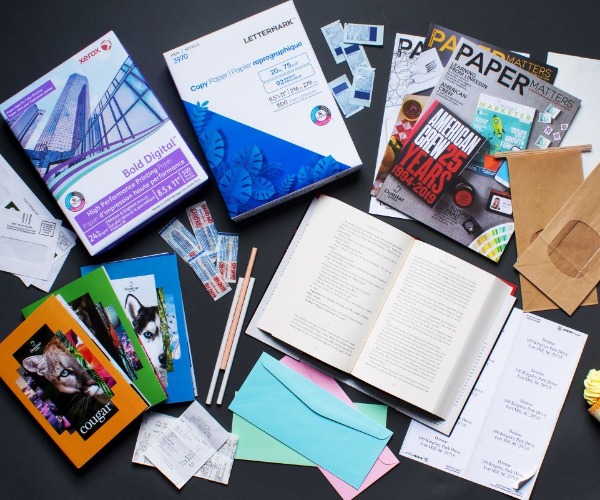
The smoothness and gloss of paper directly influence how light interacts with printed ink and how saturated the colors appear.
Smooth paper has a more uniform surface, allowing the ink to spread evenly and form a continuous ink film. This enhances color density and sharpness. Conversely, rough paper absorbs ink unevenly, leading to dull colors and blurred details.
Gloss level also affects visual brightness. The higher the paper gloss, the more light it reflects, giving the print a shiny and vivid appearance.
For example, when the same image is printed on coated paper and offset paper, the coated paper produces a brighter, clearer image because of its dense coating and high gloss, while the offset paper appears more muted.
From a manufacturing standpoint, paper gloss depends on the coating formula and calendering process. If you are printing high-end materials like catalogs or book covers, high-gloss coated paper or coated white card will deliver superior results.
Ink Absorption and Ink Penetration
How ink behaves on paper depends largely on the paper’s ink absorption and porosity.
Highly absorbent papers such as offset paper quickly draw in the ink’s vehicle, preventing pigments from staying on the surface. This causes the color to appear lighter and less saturated, reducing gloss. Tests show that the same ink can produce a density difference of up to 0.3 when printed on papers with different absorption rates.
On the other hand, papers with low absorbency—like high-gloss coated paper—keep the colors vibrant but may cause slower drying and smudging if not properly treated.
Paper absorbency is affected by:
Pore structure: Looser fibers and larger capillaries increase ink penetration.
Coating thickness and composition: The finer and more compact the coating, the less ink it absorbs.
Printing process parameters: Pressure, speed, and ink viscosity also influence how ink interacts with the paper surface.
Before printing, it’s best to conduct an ink receptivity test to evaluate the paper’s surface wetting and absorption properties. For color printing, choose paper with moderate absorbency and good ink fixation—this ensures the pigments remain bright without seeping too deep into the sheet.
Paper pH Value and Chemical Stability
The chemical stability of paper is another key factor affecting long-term color performance.
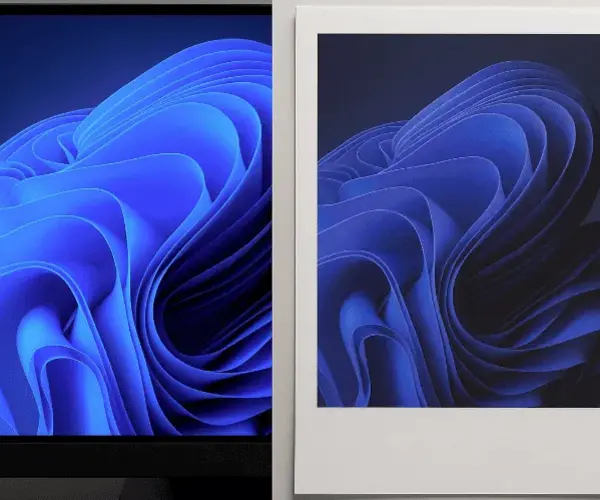
If acid-based sizing or fillers are used during papermaking, the final product may have a low pH value (below 5.5). Since many inks contain weakly alkaline pigments or binders, an acid-base reaction can alter the pigment structure, leading to color shifts over time. For instance, cyan ink may turn slightly green, and red ink may lose its brightness.
Using neutral or alkaline paper (pH around 7) helps prevent this issue. Neutral paper not only maintains color stability but also improves paper durability and aging resistance.
That’s why most modern printers now prefer neutral-sized paper over acidic paper—especially for applications such as books, magazines, and art prints where color fidelity matters.
Conclusion
The “invisible traits” of paper often determine the final look of printed colors. From brightness, smoothness, and gloss to ink absorption and pH stability, each factor can subtly alter your print results. At Golden Paper, we provide consistent, high-quality printing paper designed to reduce color variation and enhance your printing performance. If you’re looking for reliable paper suppliers, contact us today for samples or quotations.
 GOLDEN PAPER
 EN
EN
 fr
fr  de
de  es
es  it
it  ru
ru  pt
pt  ar
ar  vi
vi  tr
tr  id
id 







.webp)


